Terpmongers
Brand Build
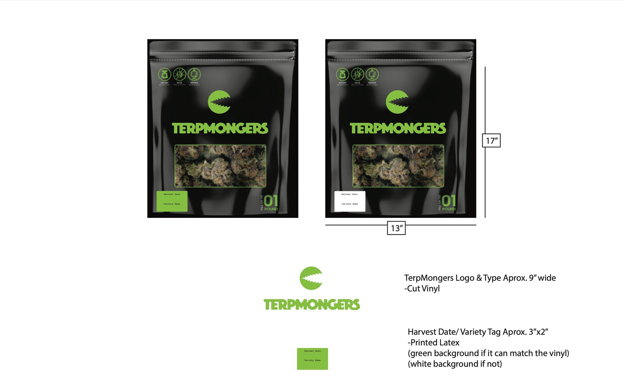
In the Discovery Workshop with Terpmongers, it became clear they would need an entire brand build in order to step into the vision they had for their business. I started with a naming session and narrowed down 400 potential names to 12 for presentation. Terpmongers came out on top. It had some attitude, it was unique, and it tapped into the substance, that they and their customers are obsessed with, terpenes. Terpenes are the various compounds behind the taste, smell, and psychoactive qualities of cannabis, which Terpmongers specifically breeds for and cultivates in their products. Once the name was established, I moved on to their logo design, which includes a logo mark, a logotype, and a variety of possible configurations for various uses. Next, I did multiple photo and video shoots and created a content calendar to start strategically building connections around their story and some hype around their product.





Logo Design
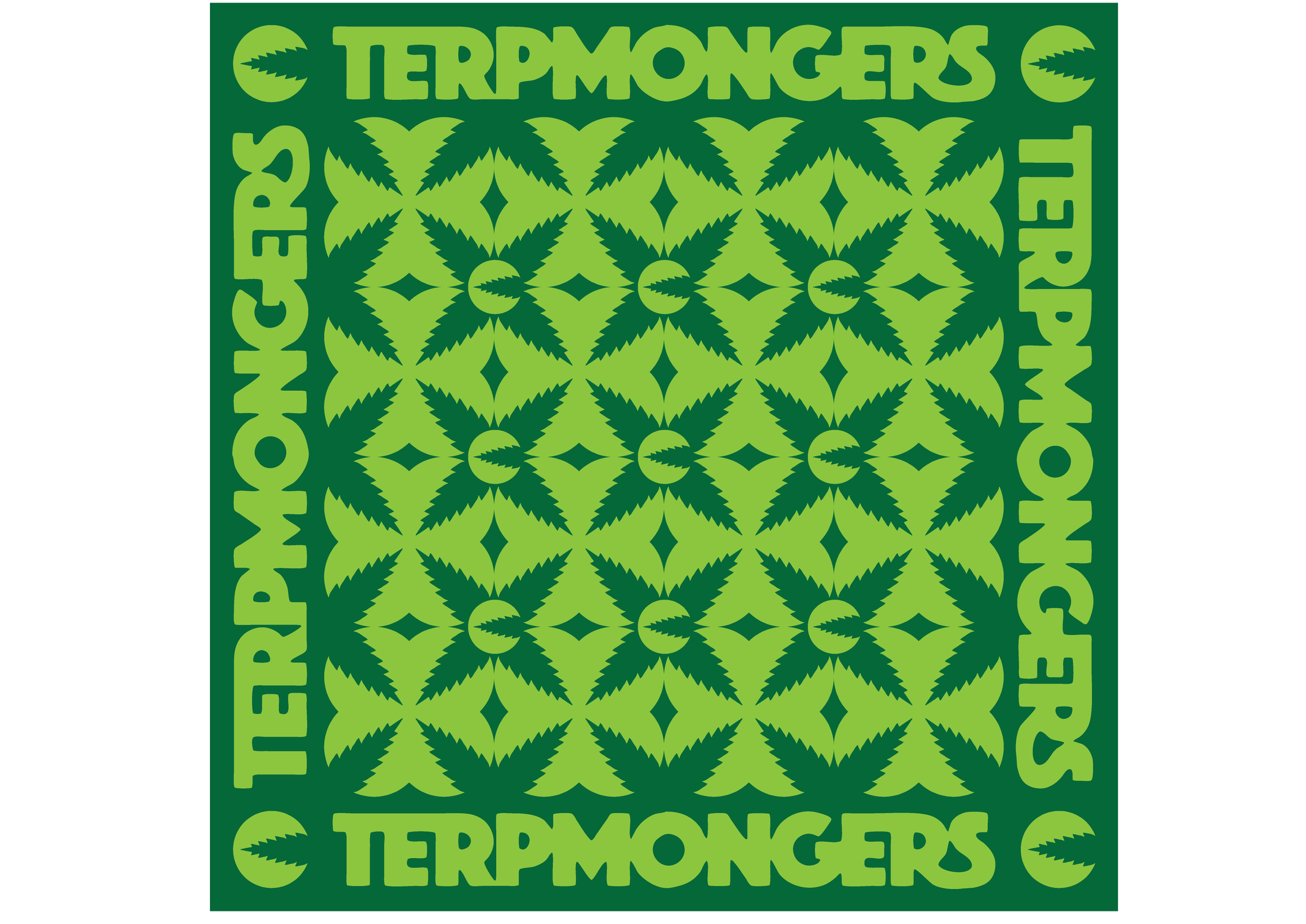
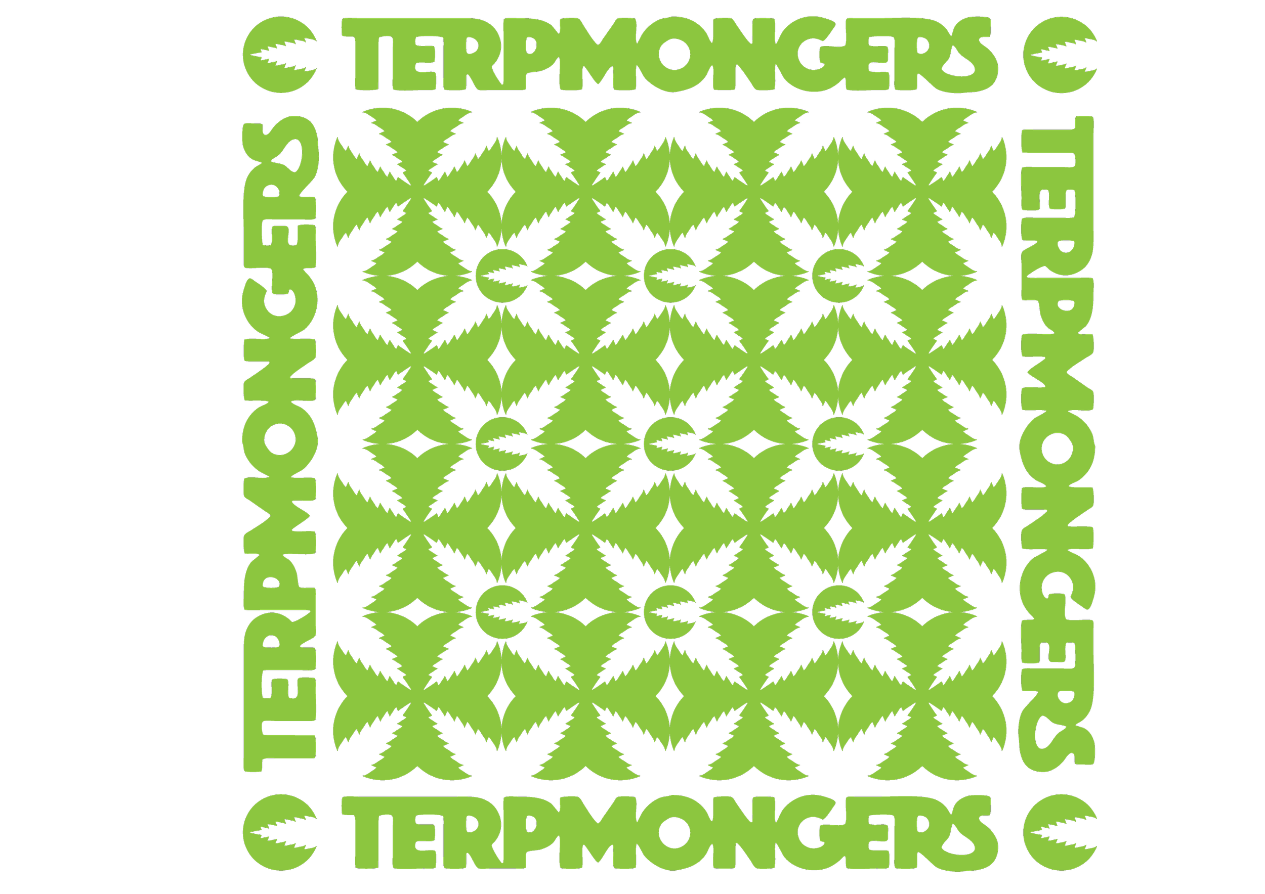
I created a variety of logo directions for Terpmongers to choose from. The clear favorite was this quirky leaf over a circle that could also be seen as a jagged toothed character. We fine-tuned the leaf shape and created a bold logo type to go with it, and then we were off. Once the design was determined, we created a variety of alternative treatments to fit various potential uses, such as packaging, clothing, patches and stickers, and graphic overlays.
